Wizefloor Website Design & Development
Website Design
Motion Design
Project Summary
Client: Wizefloor
Industry: Technology
Results: Improved design and user experience, better user journey paths, clear product information, flexible content management system (CMS) for smooth editing experience
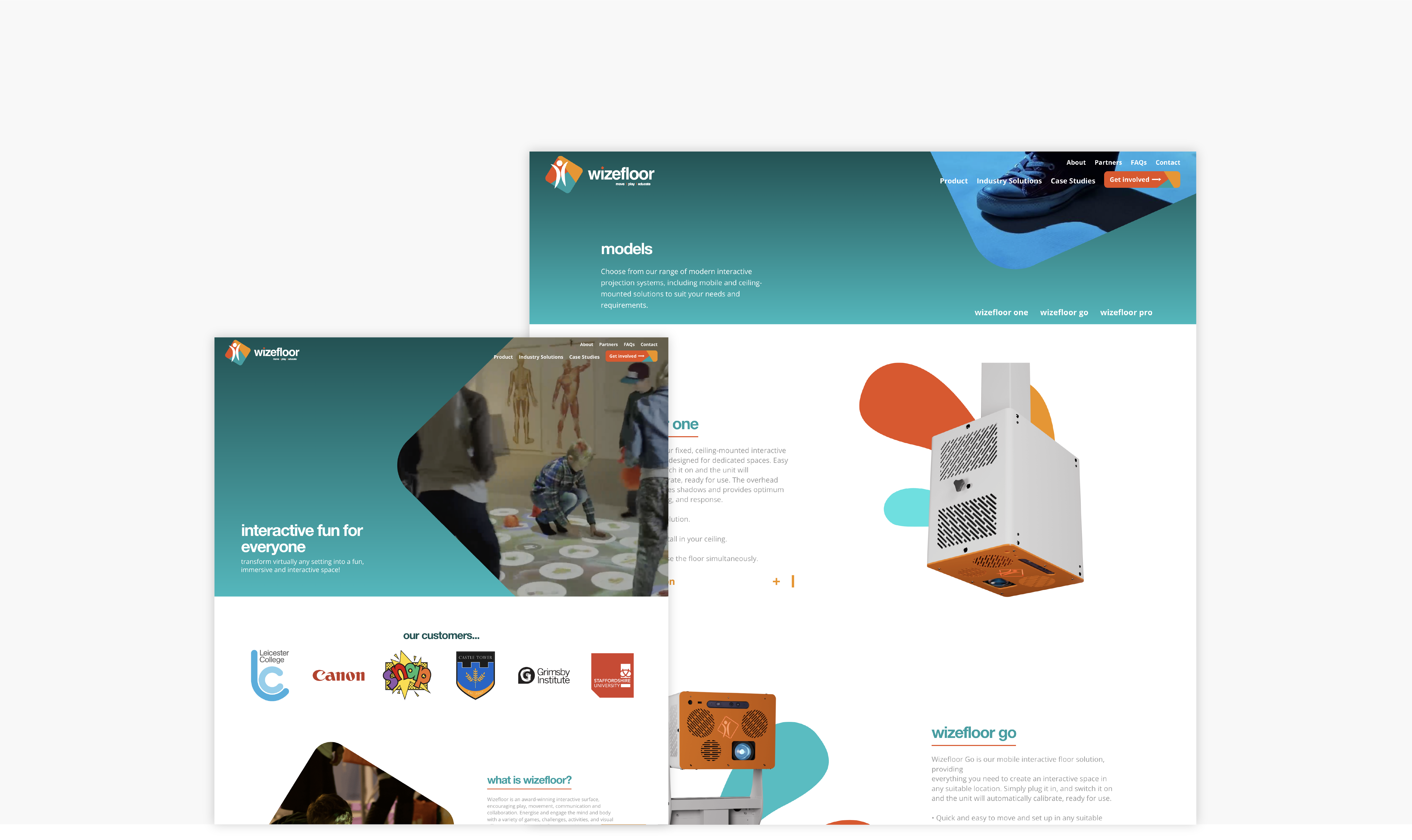
The website followed a new rebrand of Wizefloor, giving our team a vibrant logo and colour palette to work with. As the website was completely brand new, we started out by creating a sitemap for the website, focusing on the key areas and selling points throughout.
Key to the website was interactivity, fun and engagement which allowed our team to play around with animation and motion design. Following presentation of some of our exciting ideas, our team created an interactive header for the homepage of the website, featuring engaging animation and cursor game to embody Wizefloor's product.
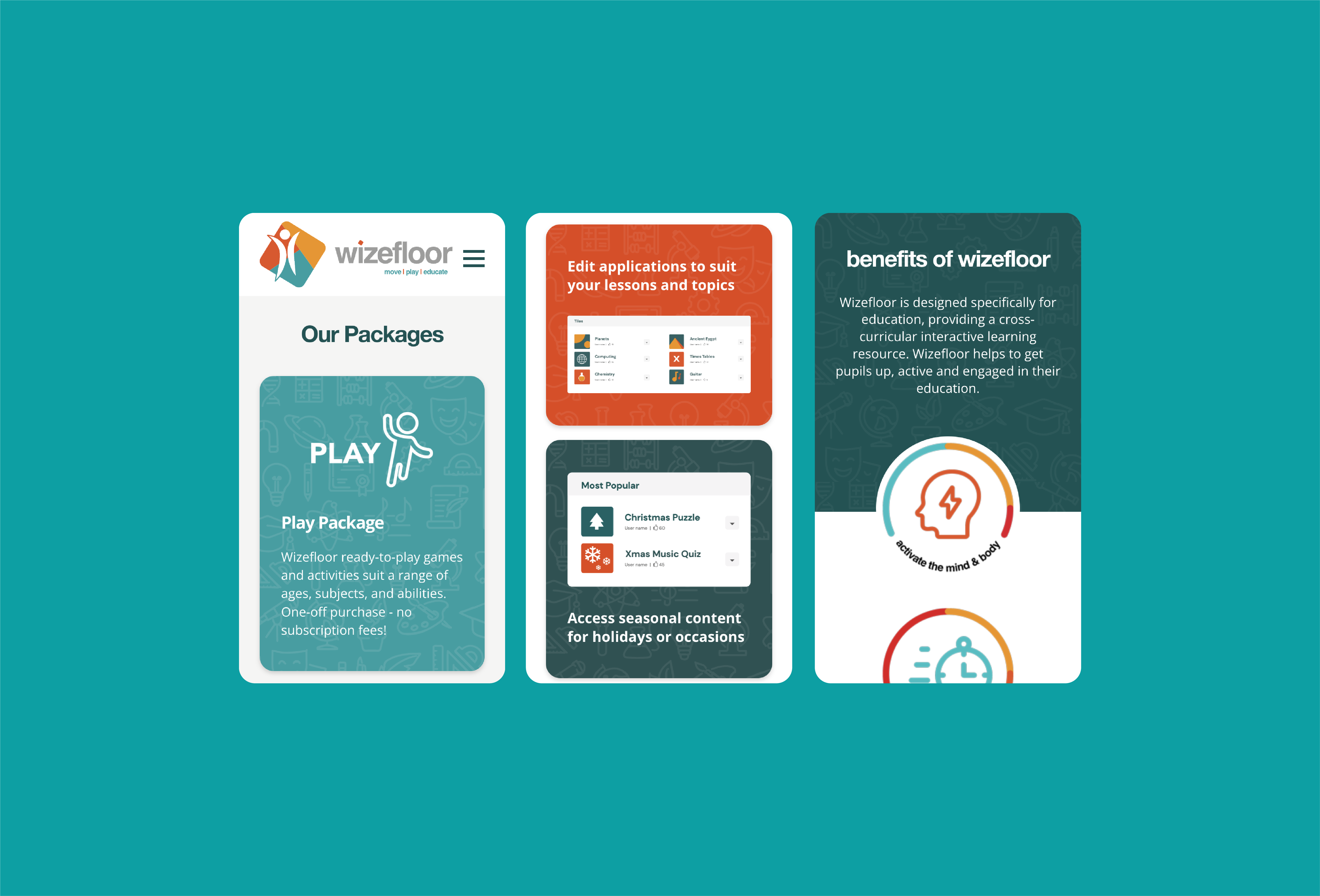
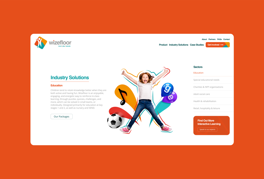
The website gives Wizefloor an online platform to showcase their product and solutions for the industries they work with, as well as appeal to potential partners and resellers. The flexibility of the CMS allows the team at Wizefloor to edit and manage all website content, adding case studies and product updates at their own leisure.
As with all of our websites, the site is fully optimised for phones and tablets, giving an engaging user experience across all devices.
